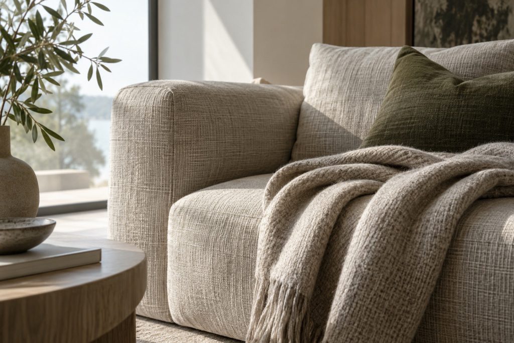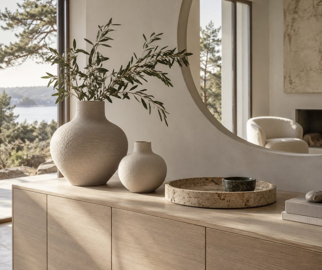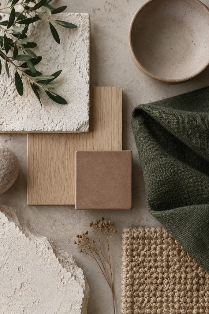
A connected palette does not require every room to use the same colors in the same amounts. A repeated undertone, material or accent can carry a relationship from one space to the next while leaving room for each space to feel distinct.
Start with what will stay
Flooring, large furniture and fixed finishes are useful starting points because they occupy so much of the view. Lay samples of possible additions beside those existing surfaces. It is easier to build a palette around real constraints than to begin with an image and discover later that its colors conflict with the parts of your home you want to keep.
Give each color a role
Choose a background tone, a material tone and a smaller accent. The accent does not need to appear in every object. A forest-colored cushion can connect with a darker ceramic piece elsewhere without creating a matched set. Leave some surfaces quiet so that the repeated color remains noticeable rather than becoming visual noise.
Check more than one moment
Look at the palette in daylight and under the lamps you normally use. A sample held upright may read differently from the same sample lying flat. If possible, leave the combinations in place for a few days. You are choosing colors for a changing home, not a single photograph, so allow the decision to include ordinary mornings and evenings.
Editorial concept for the Formrest demo. The cover is an AI-generated illustration, not a photograph of a product for sale or a completed client project.